Mobile First – compass navigation for WU Executive Academy
The Holy Grail of Web Design - Responsive Design - has been misused in recent years to display all content. Through endless lists, users got unstructured information and thumb arthrosis. The possibilities and limitations of the content presentation on the smartphone were neglected. Time for Digitalsunray to question this concept and to focus on the mobile use of websites.
In 2015, a new concept for user guidance and interaction design emerged in the Design Think Tank from Digitalsunray. This concept was presented to the WU Executive Academy on its newly redesigned mobile website www.executiveacademy.at one year later.
The question that I posed at the time was not to be understood as a general attack on Responsive Design. Rather, it was about how this concept was used by many unreflected for all content to create cost-effective websites. Examining the "Mobile First" approach enabled the WU Executive Academy to rethink the presentation of content internally. And so a website was created, which pursues a clear strategy. Emotionalizing the audience and the ability to drive more conversions.
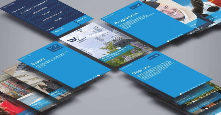
Mobile First navigation concept
With the compass navigation, you can use the four directions in which users can navigate in the smartphone browser by swiping. Each "cardinal direction" stands for a special topic group. At the WU Executive Academy are the "Program Overview", "Overview of Themes", "About the Executive Academy" and "News & Events". An own always visible menu item can change the view from an image slideshow to a textually structured enumeration. An additional "context-action" menu item also enables call-to-action for each page to further optimize the conversion.
We are pleased to be able to think and offer this concept, which can be used in many areas, for our customers more broadly and to offer!
Roll out at FH BFI Vienna
In 2019, the compass navigation was again used for the relaunch of the FH website of the BFI Vienna. Here, aswell, the focus is on mobile use, and users get a quick overview of the university's core topics.
Eat your own dogfood
We stand behind our considerations! Therefore, the website relaunch of the Digitalsunray website was naturally also based on the compass navigation!
